Southern Comfort is a whiskey that was once driven by authenticity and originality, but over time has lost its relevance and meaning.
-
ACD, The Brooklyn Brothers
Lead all creative from conception to completion -
360 campaign strategy
Vis ID book (both global and local)
Campaign identity
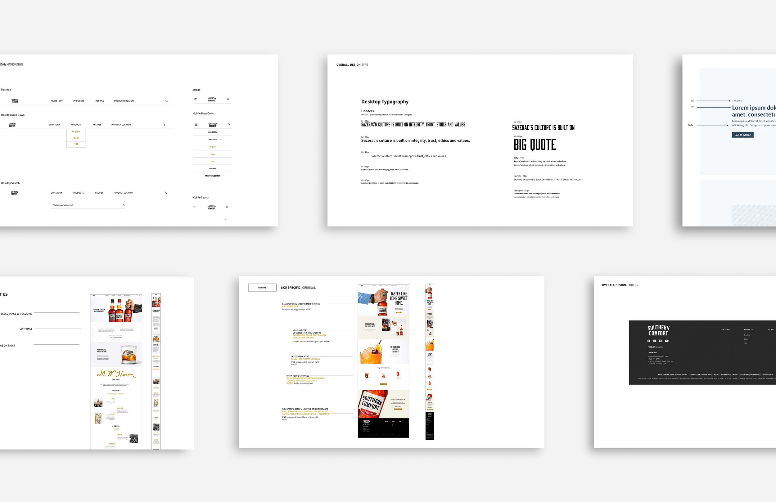
Full website redesign (site architecture, wireframes, front end web dev)
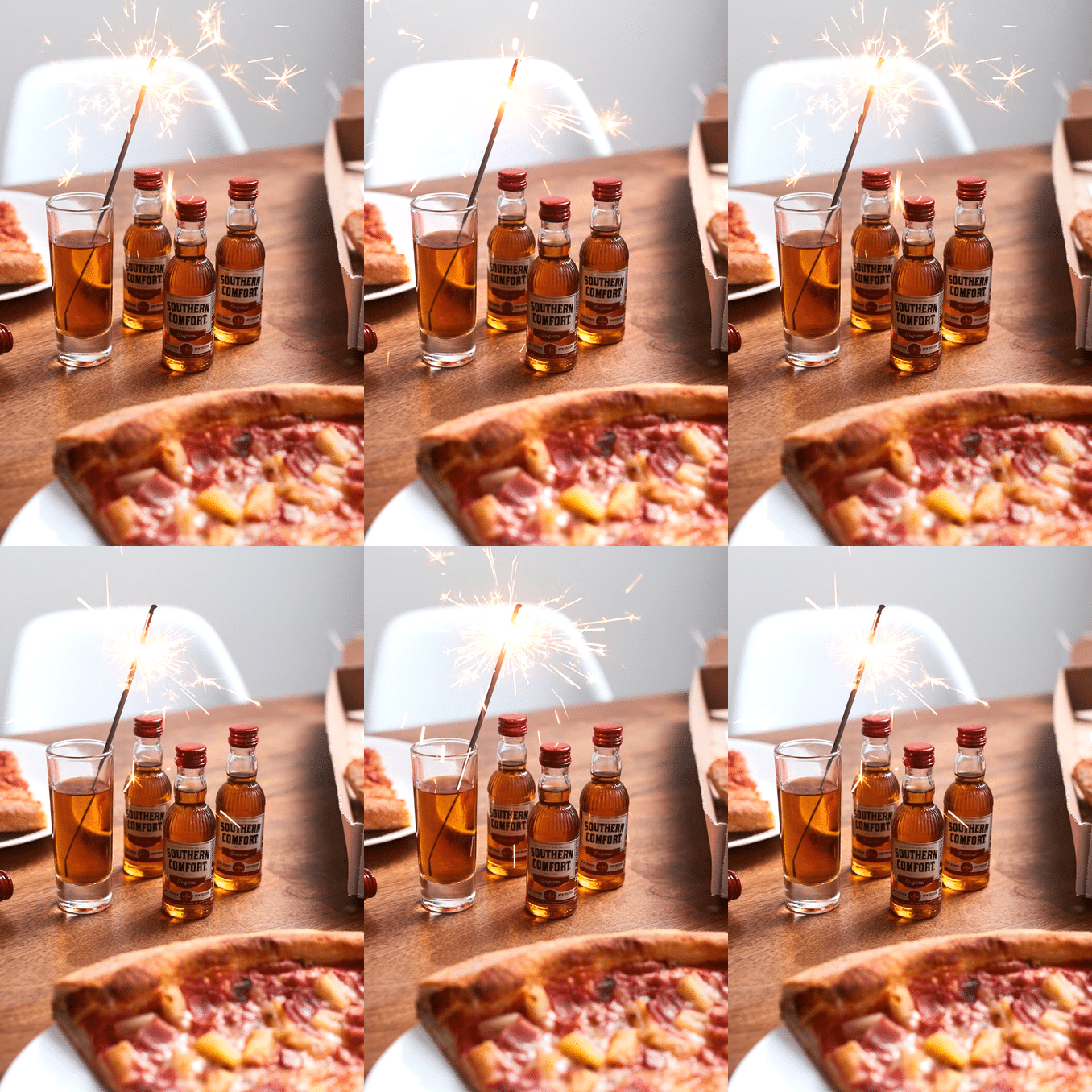
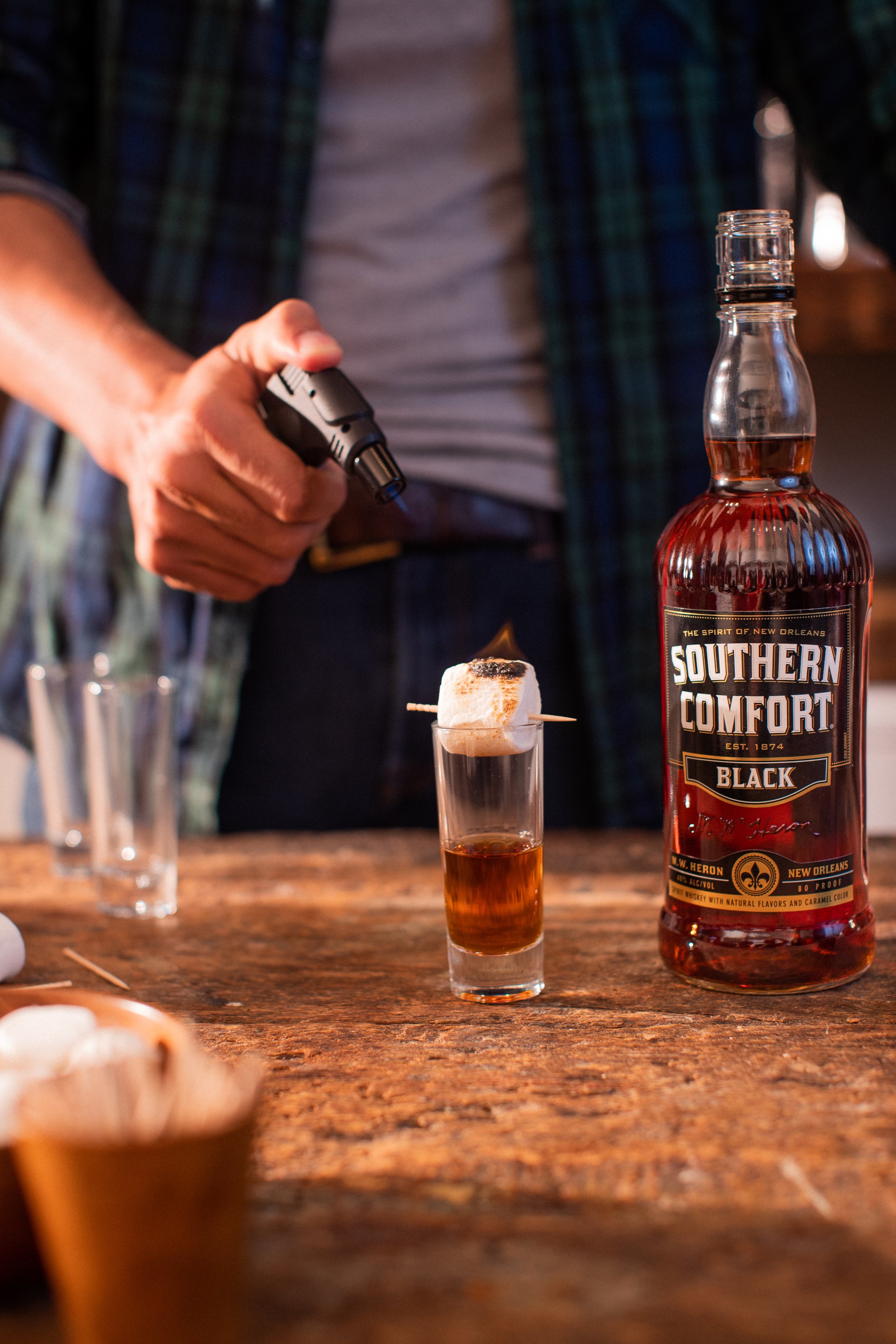
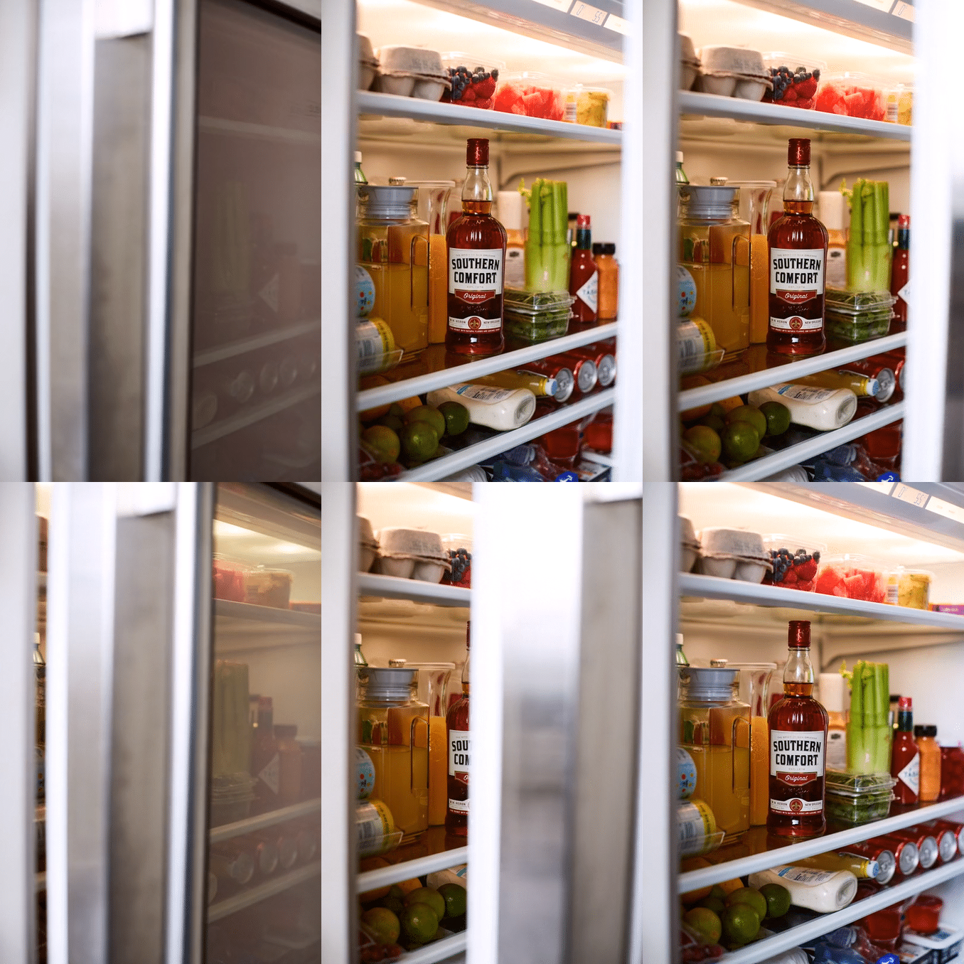
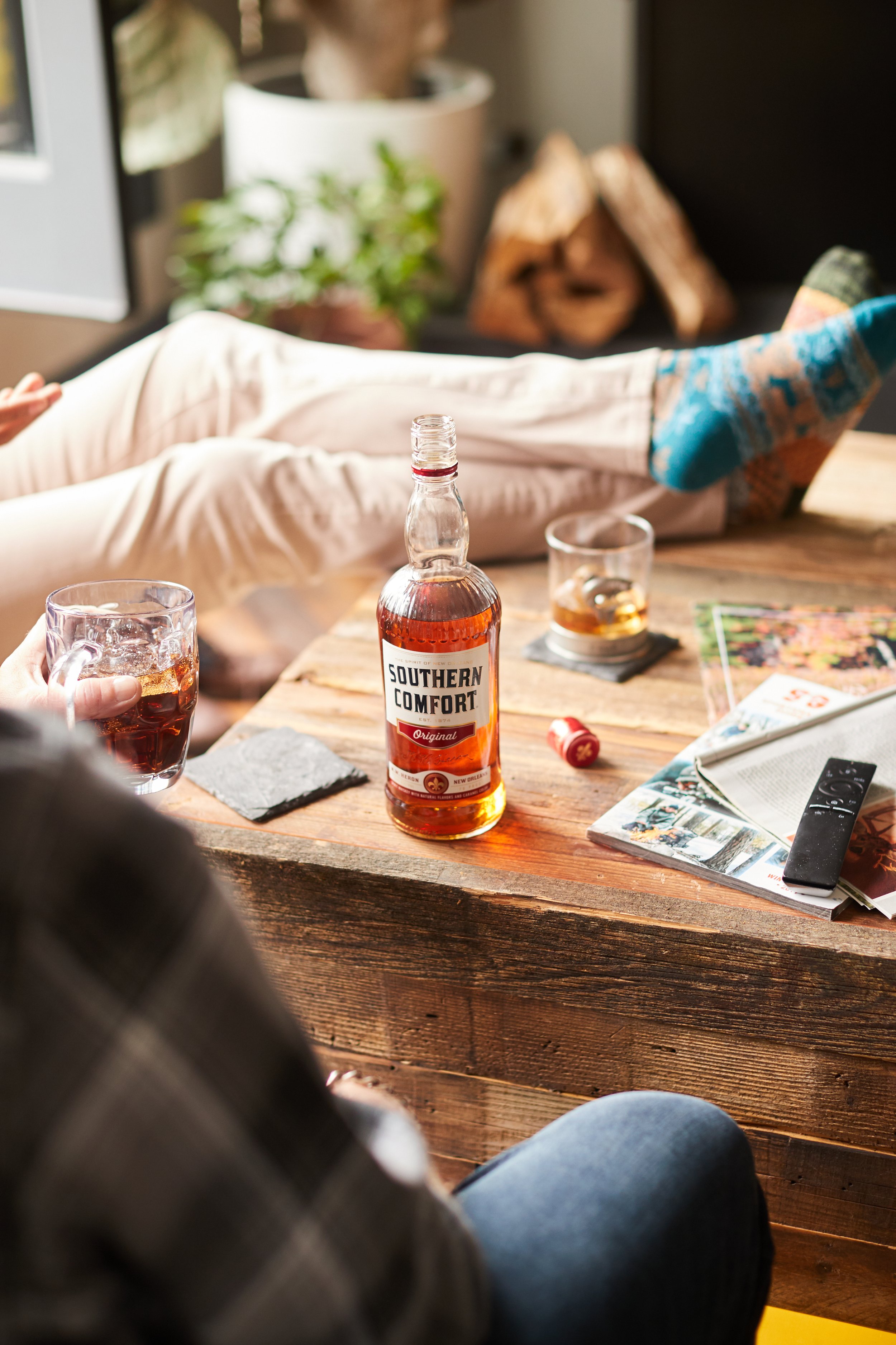
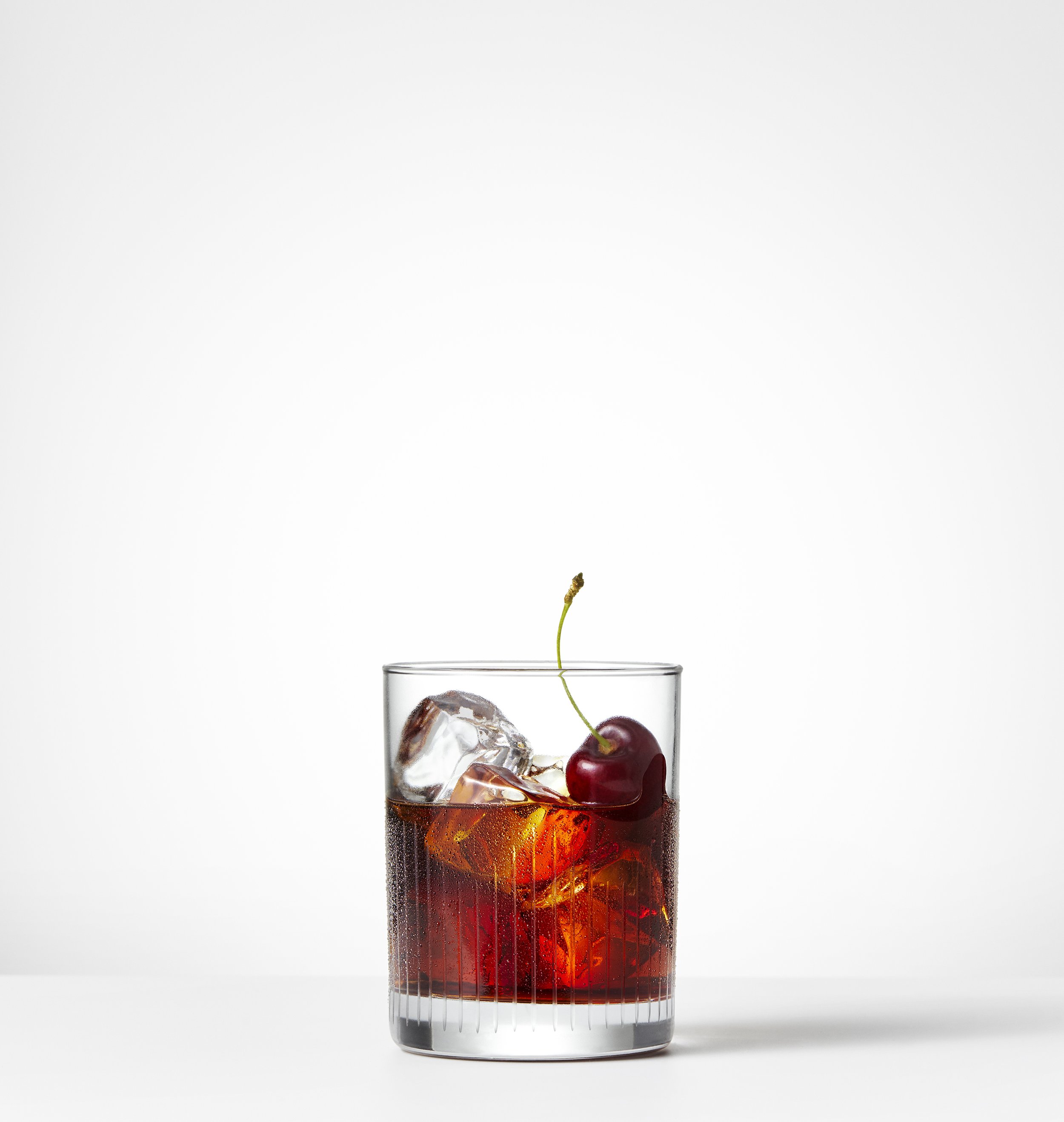
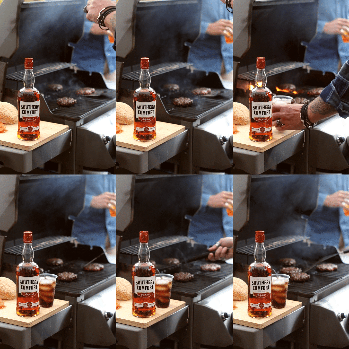
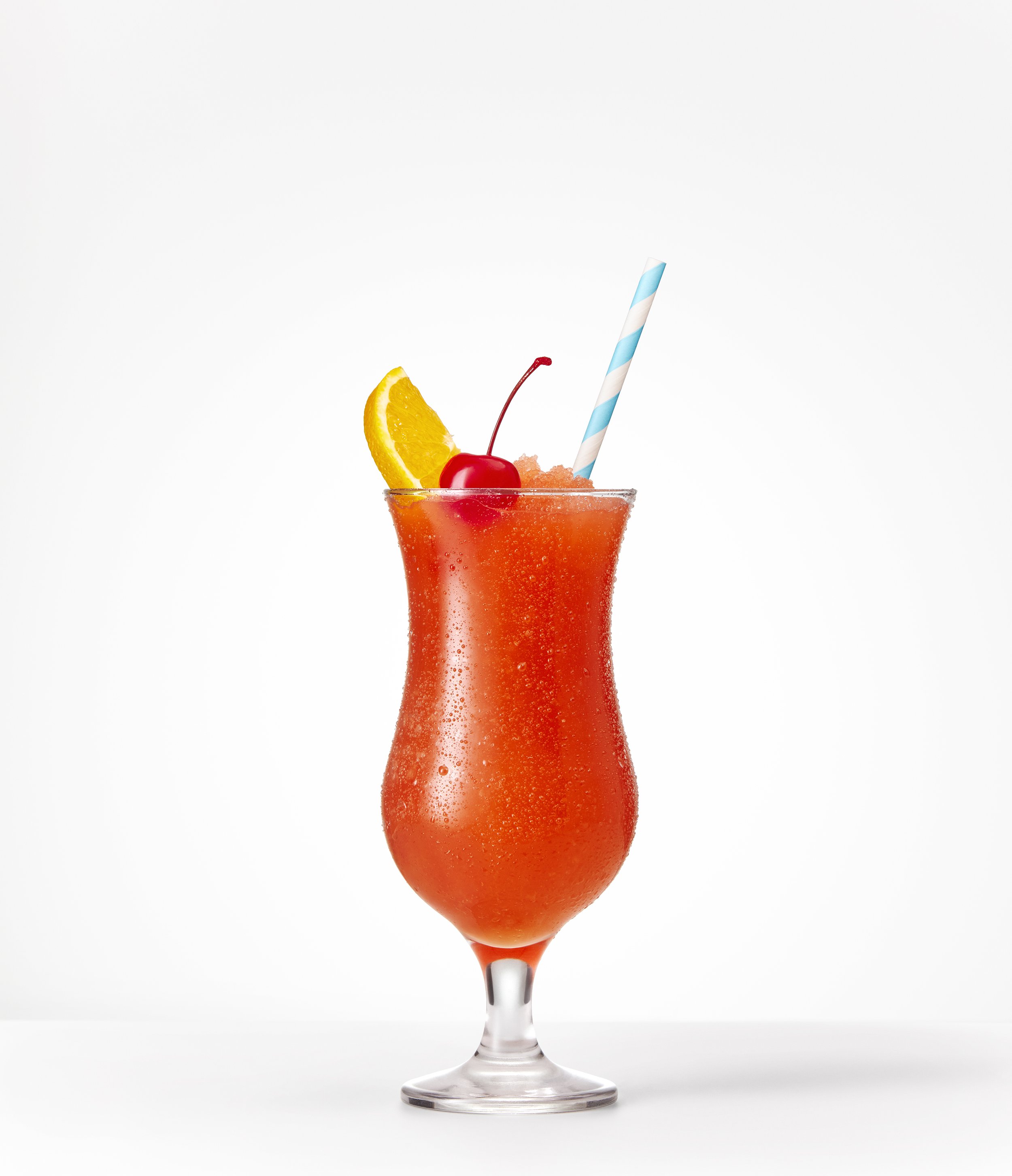
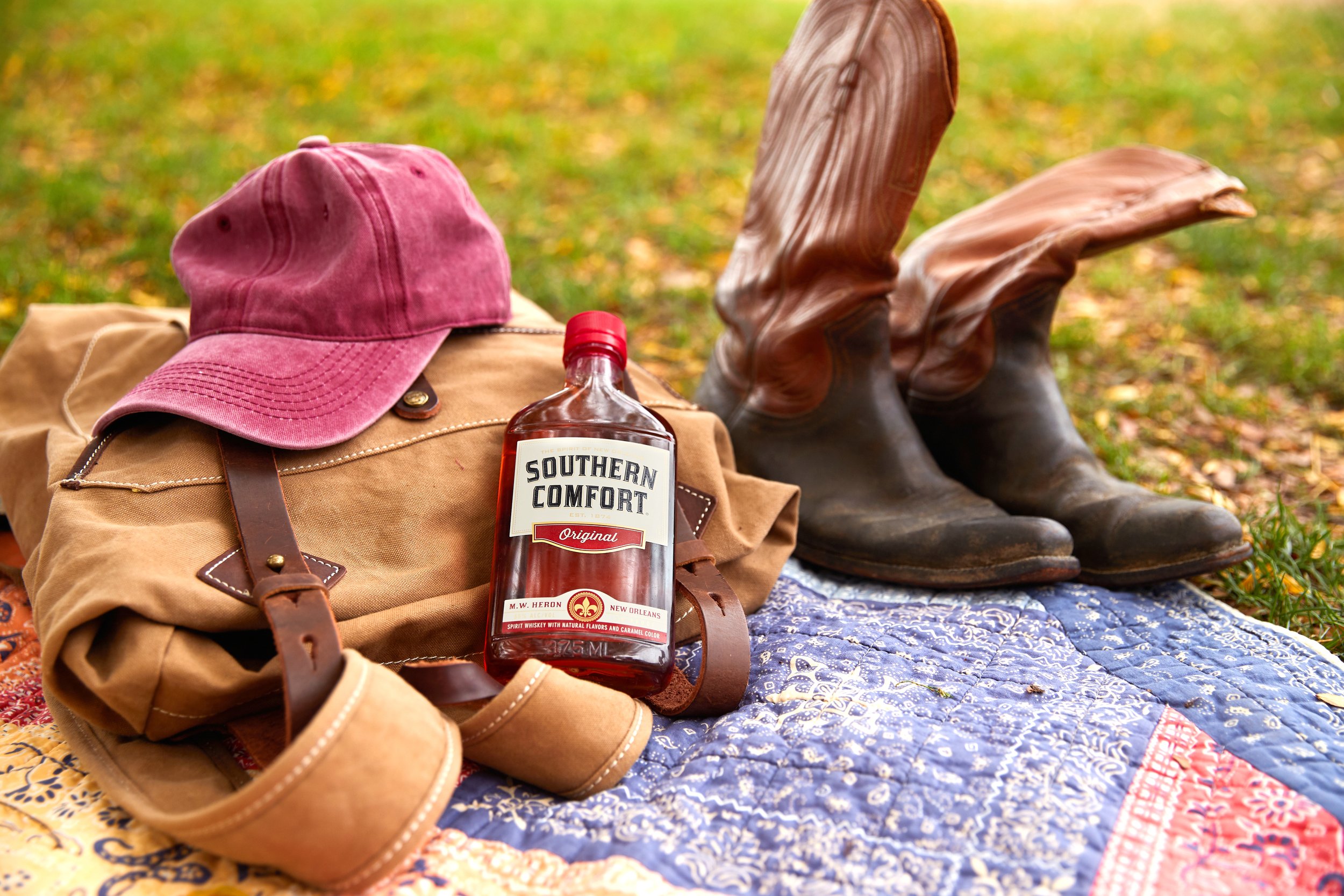
Bottle and cocktail photoshoot
:30 sec video
OOH
Print/web ads
Shelf talkers / cocktail signage
Merchandise
Full calendar year of activations/extensions
-
Photography: Sarah Anne Ward
Videography: Sarah Anne Ward
Copy: Jon Yasgur
Production: Brooklyn Brothers
Site Dev: Sagepath
The Challenge
Help Southern Comfort re-establish / clarify their brand and build global brand affinity to overcome negative sentiments.
The Creative
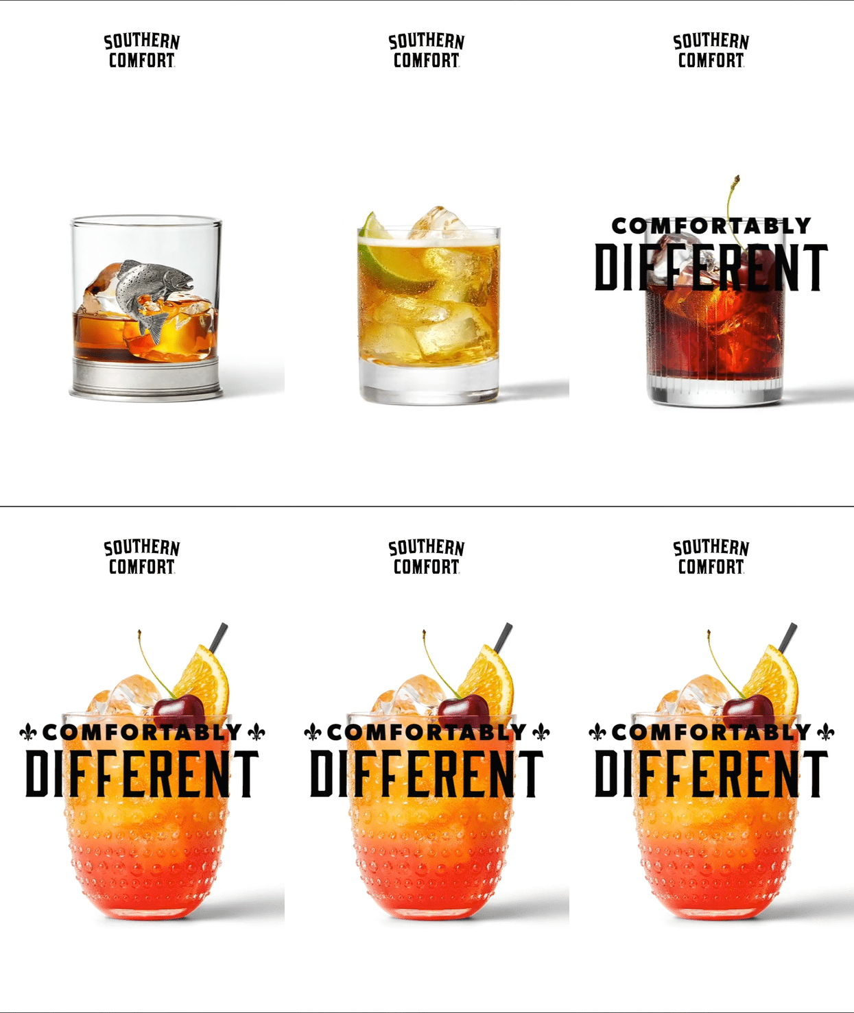
Southern Comfort brought a sweet taste and name to a familiar world of whiskey in late 1800’s, and had an unpretentious style new to traditional whiskey culture. In a modern world where the new generation pushes back against labels/lines, let’s tap into being a category-of-one, and become known as a whiskey on it’s own terms.
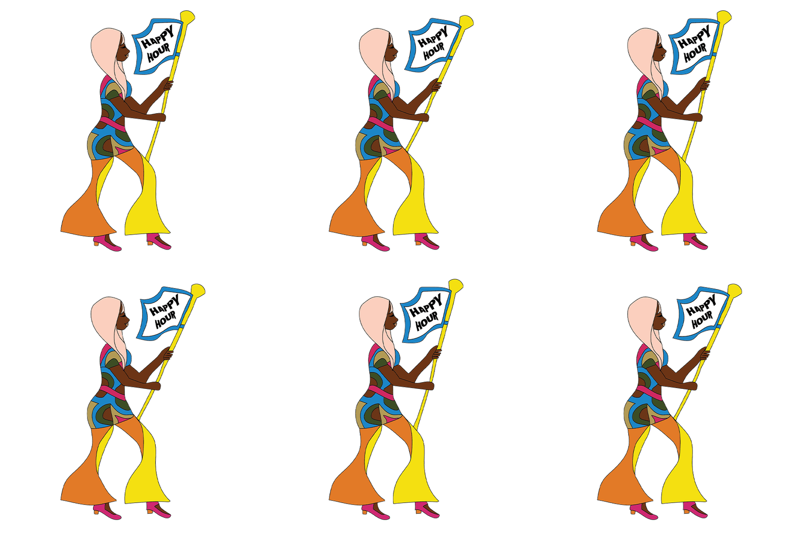
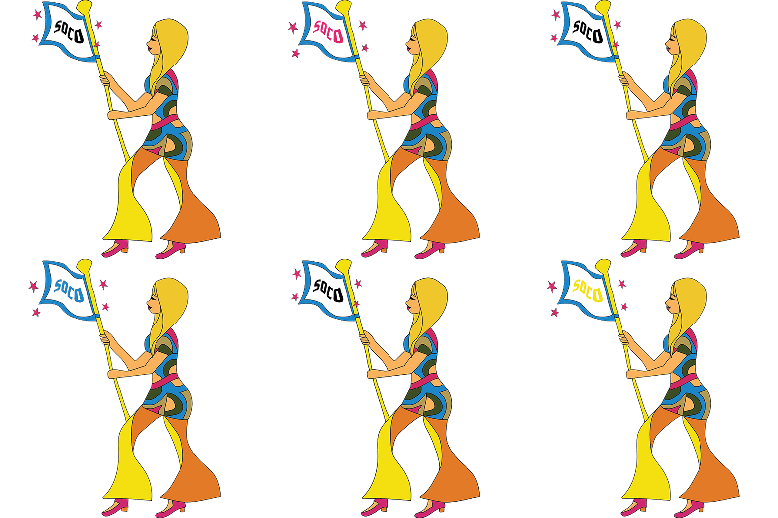
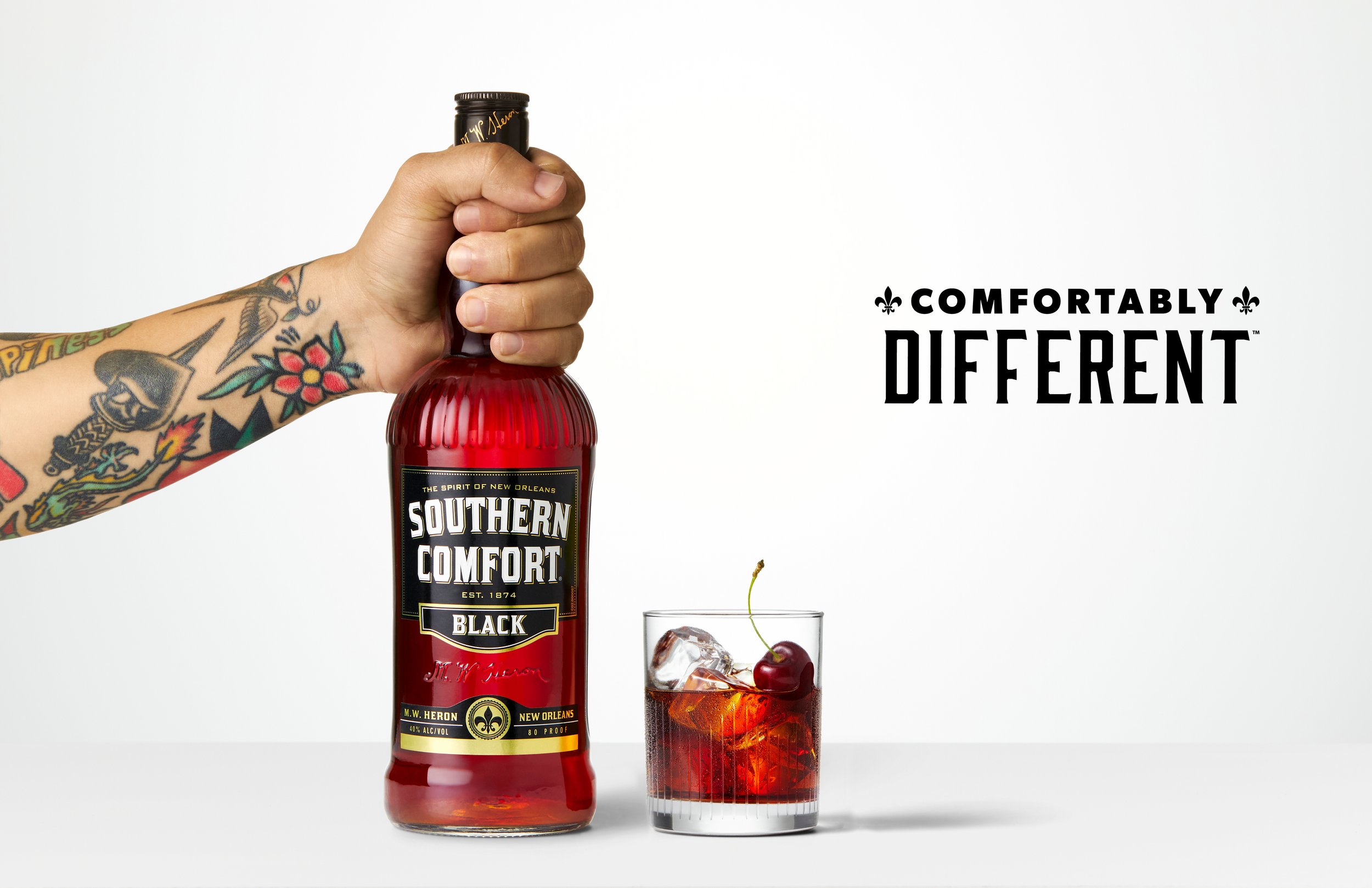
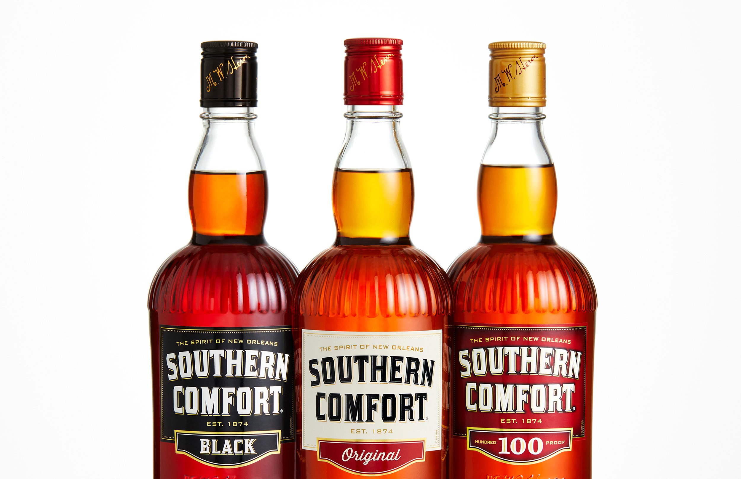
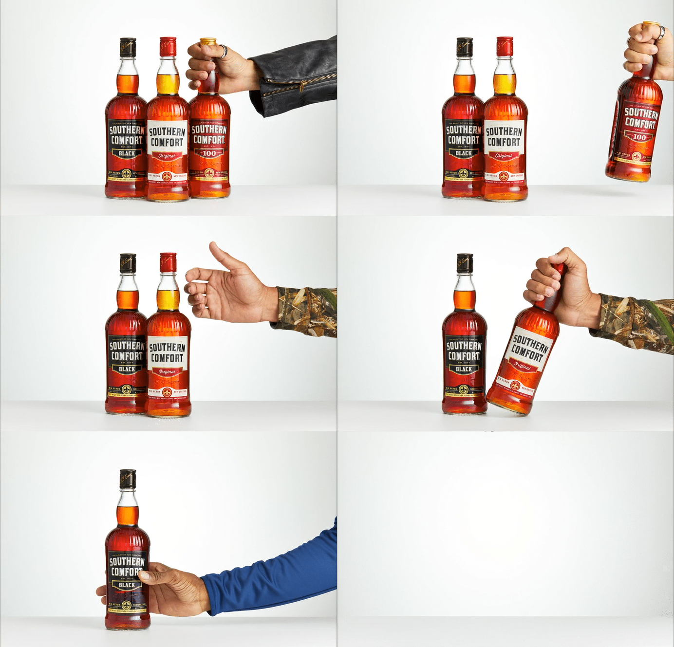
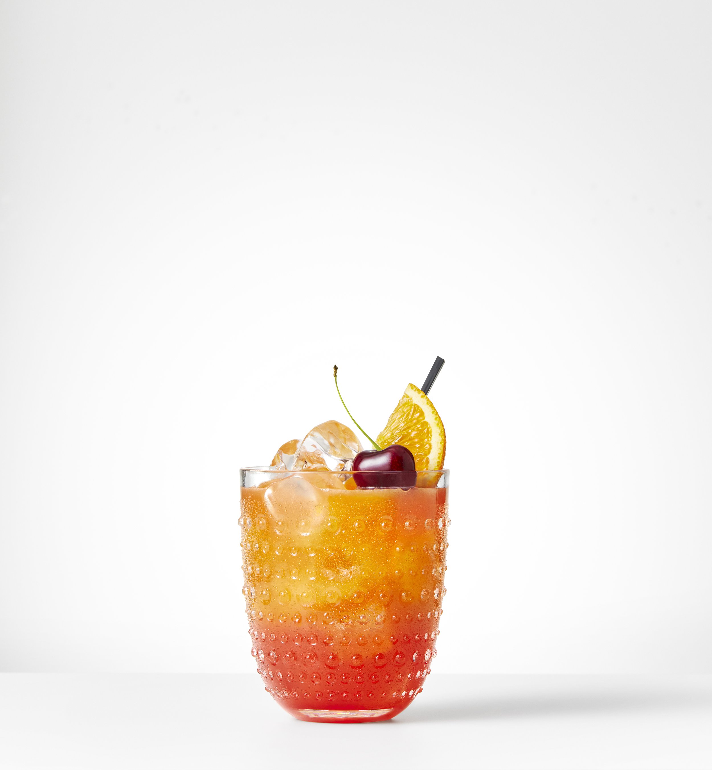
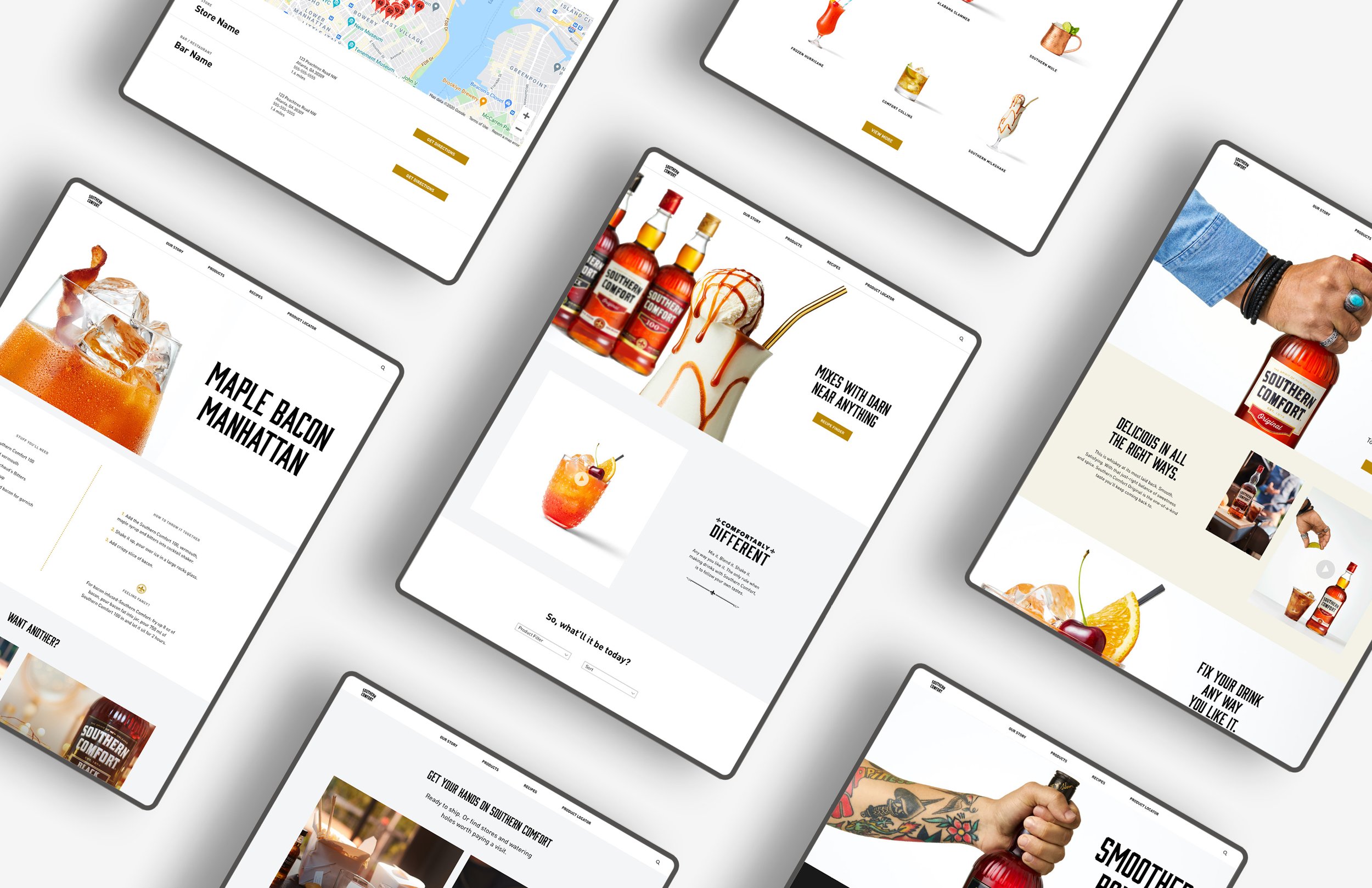
My CD and I came up with the brand campaign tagline ‘Comfortably Different’; it expresses individualism without being exclusive or full of self-importance. The Vis ID went against all whiskey tropes and brought a fresh/bright new look to the brand and category. Personality was expressed through different types of hands holding the bottle, as well as a range of colorful /unexpected cocktails.



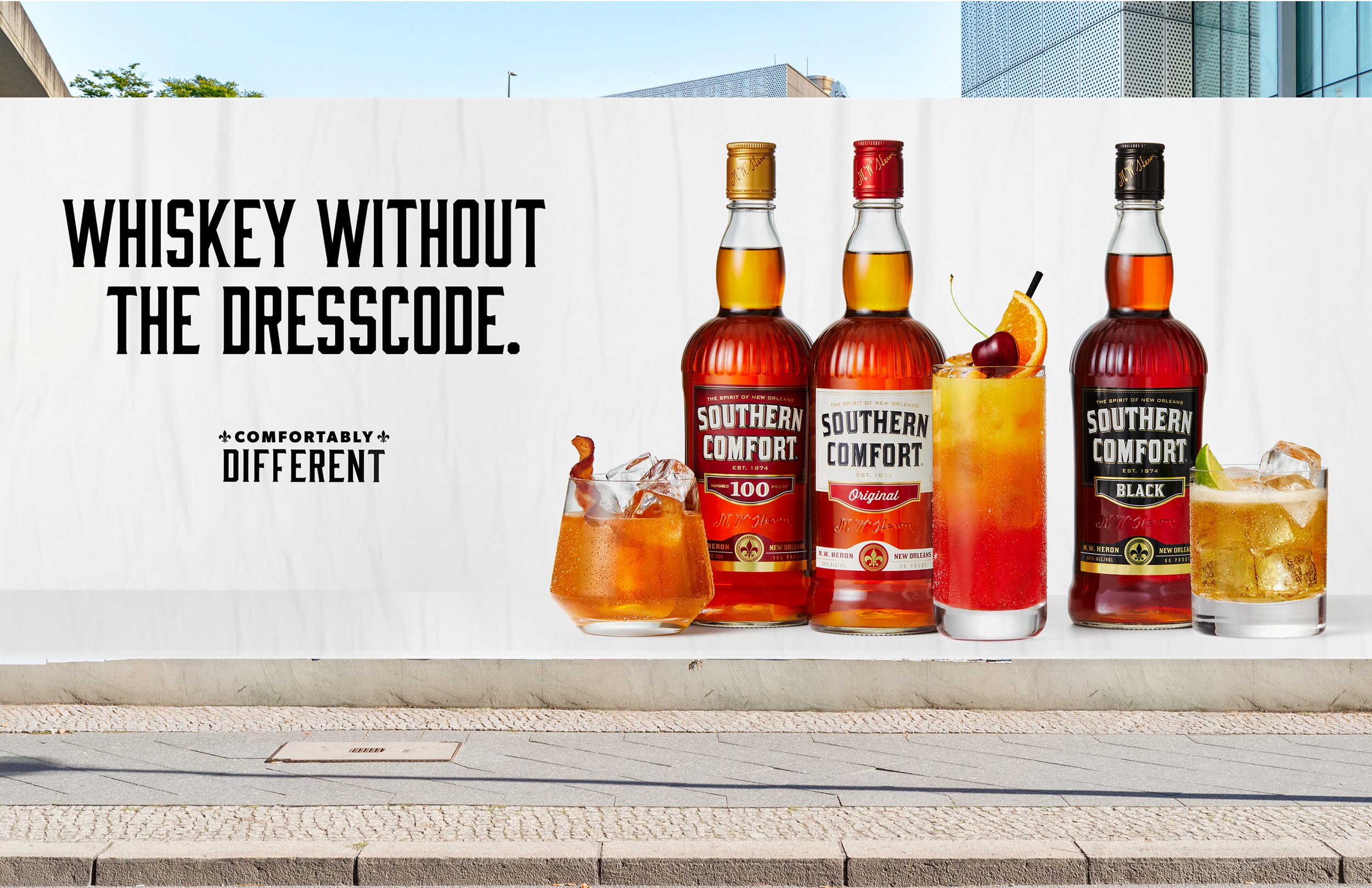
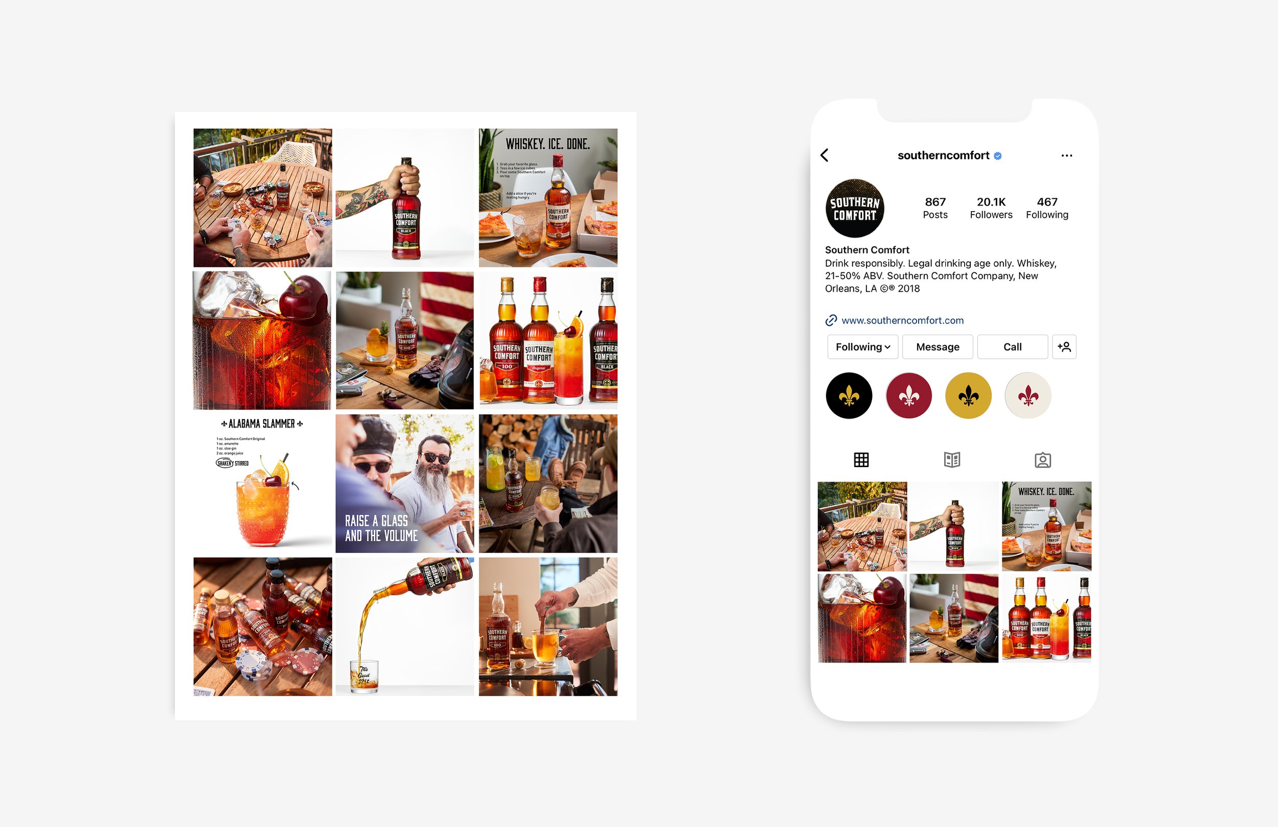

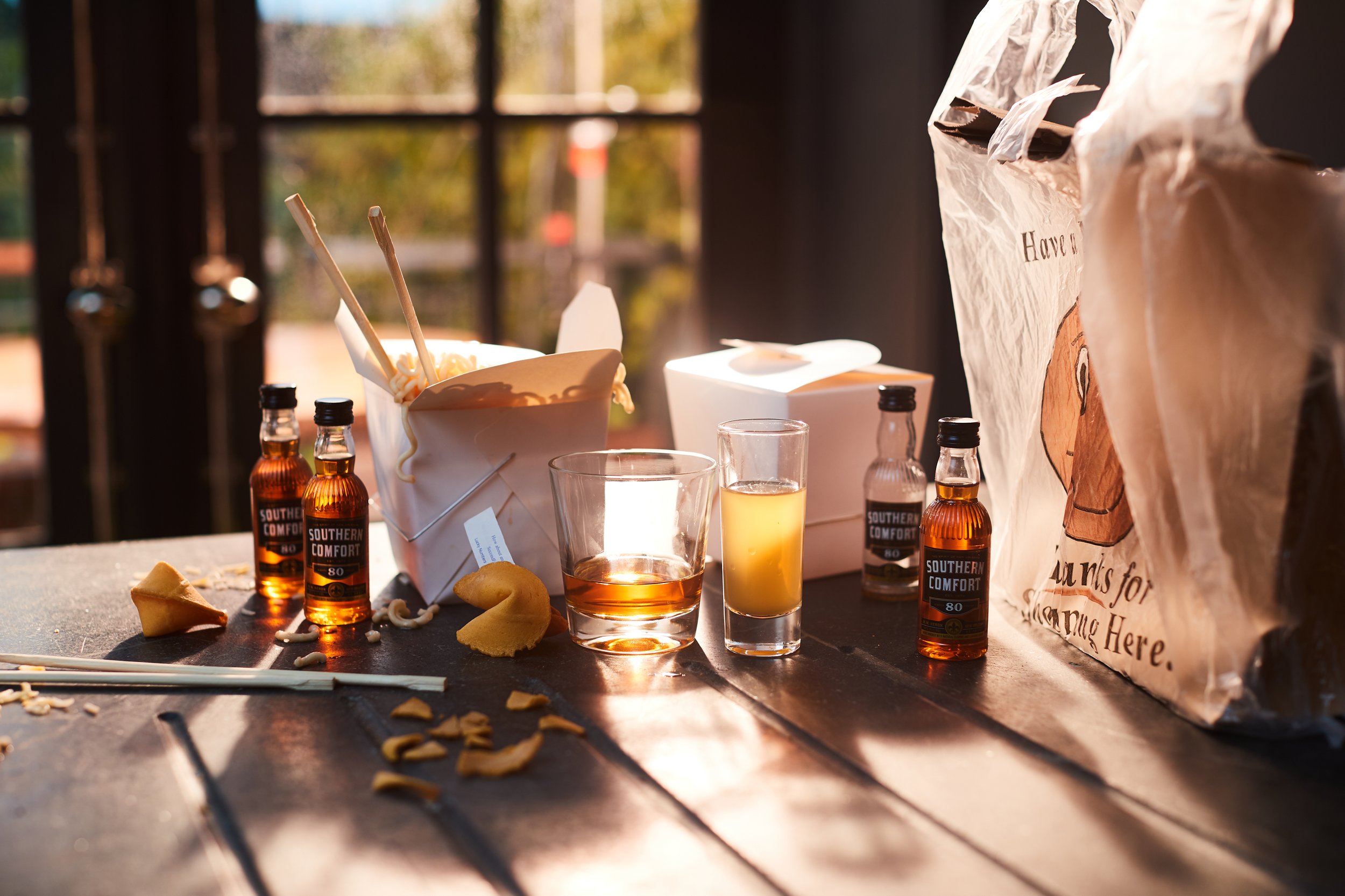
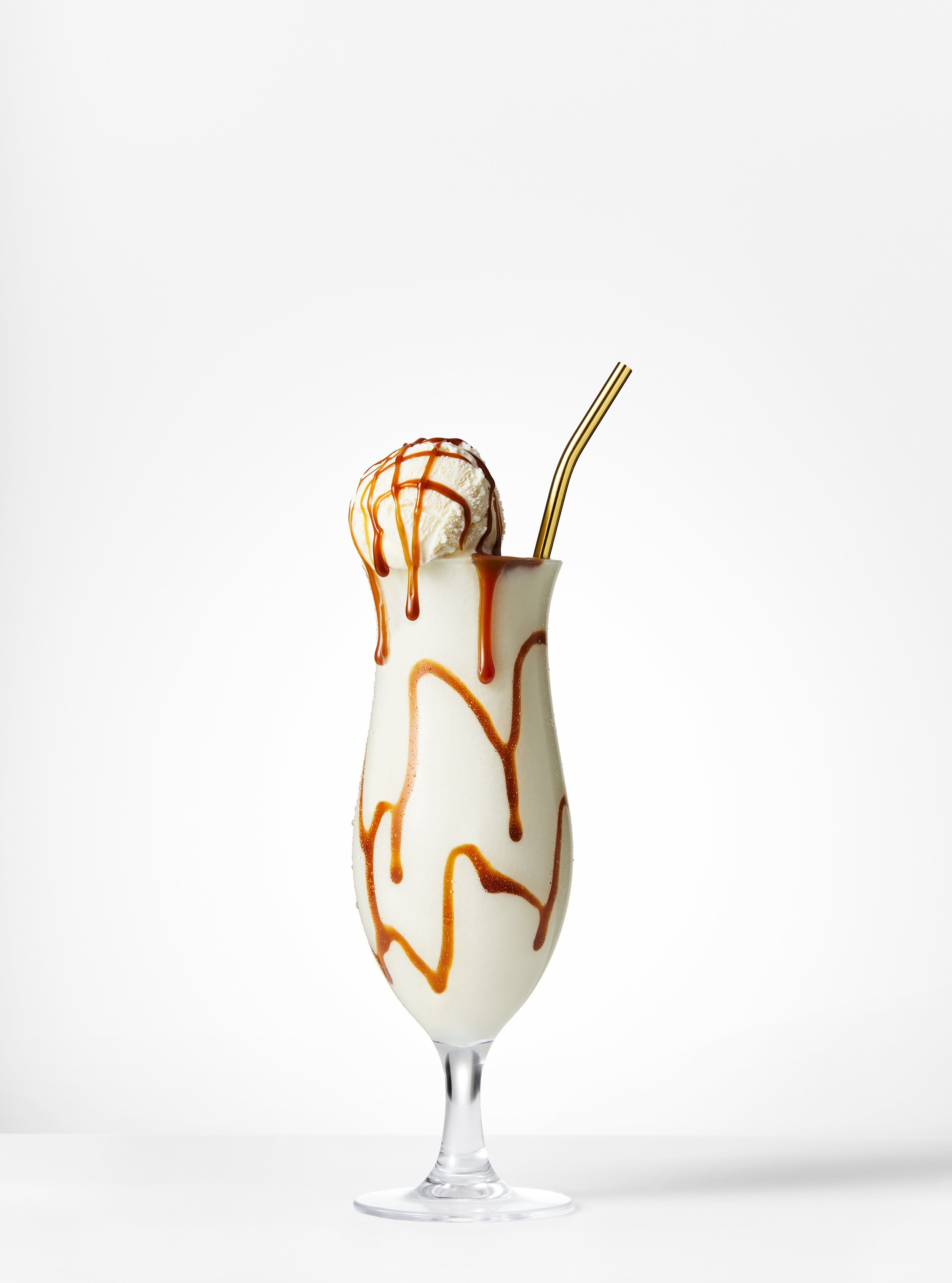
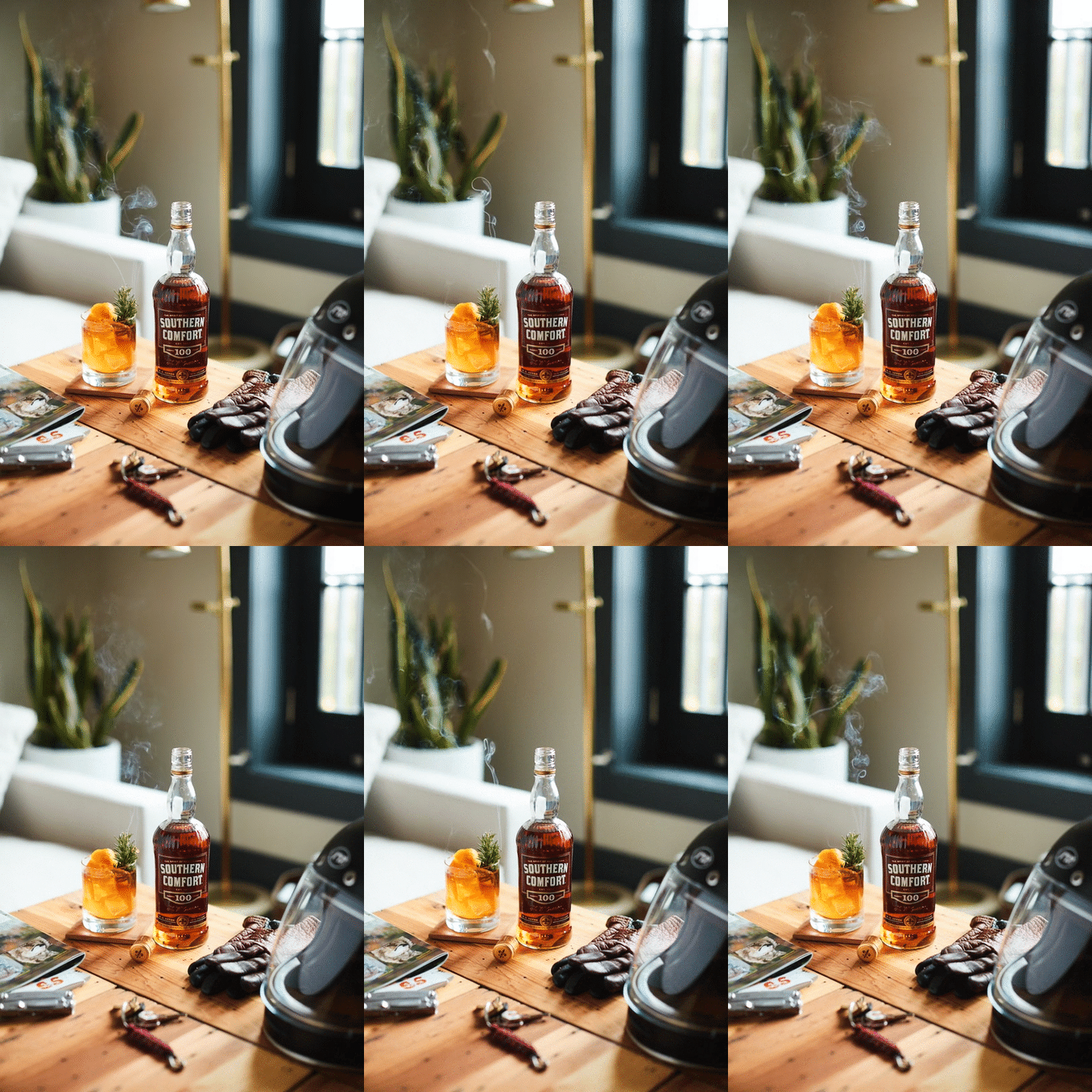
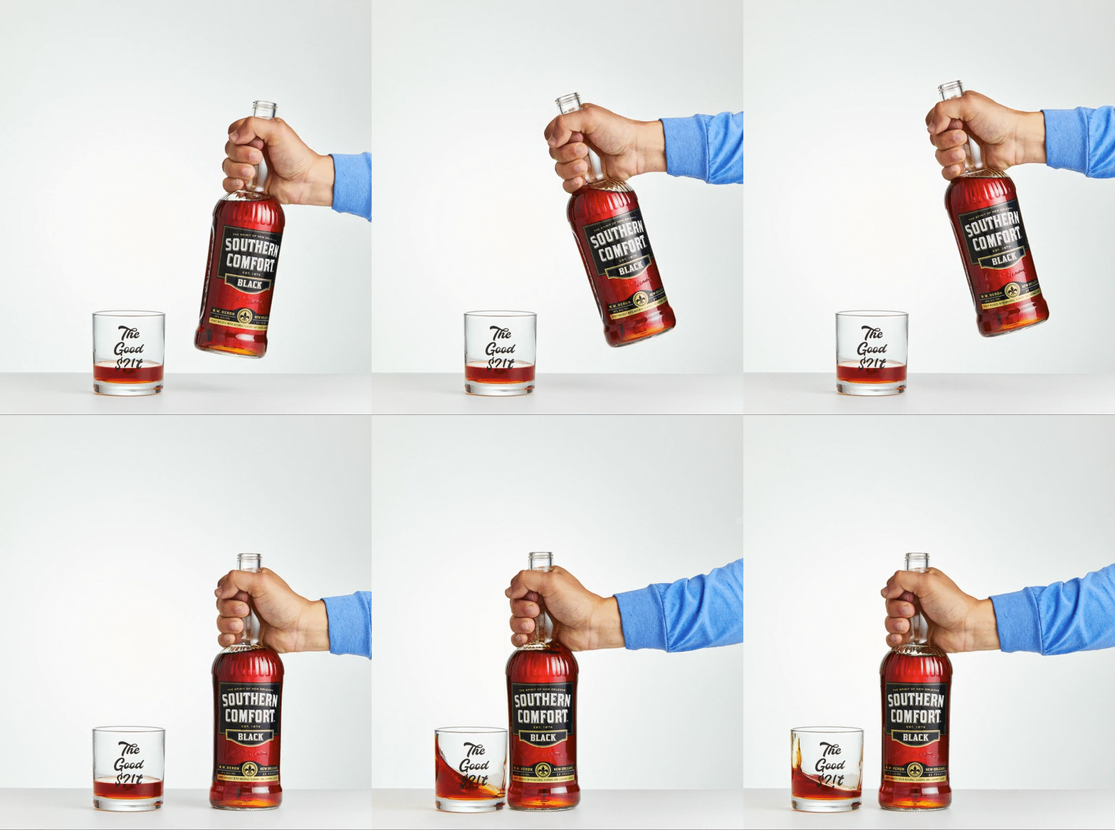
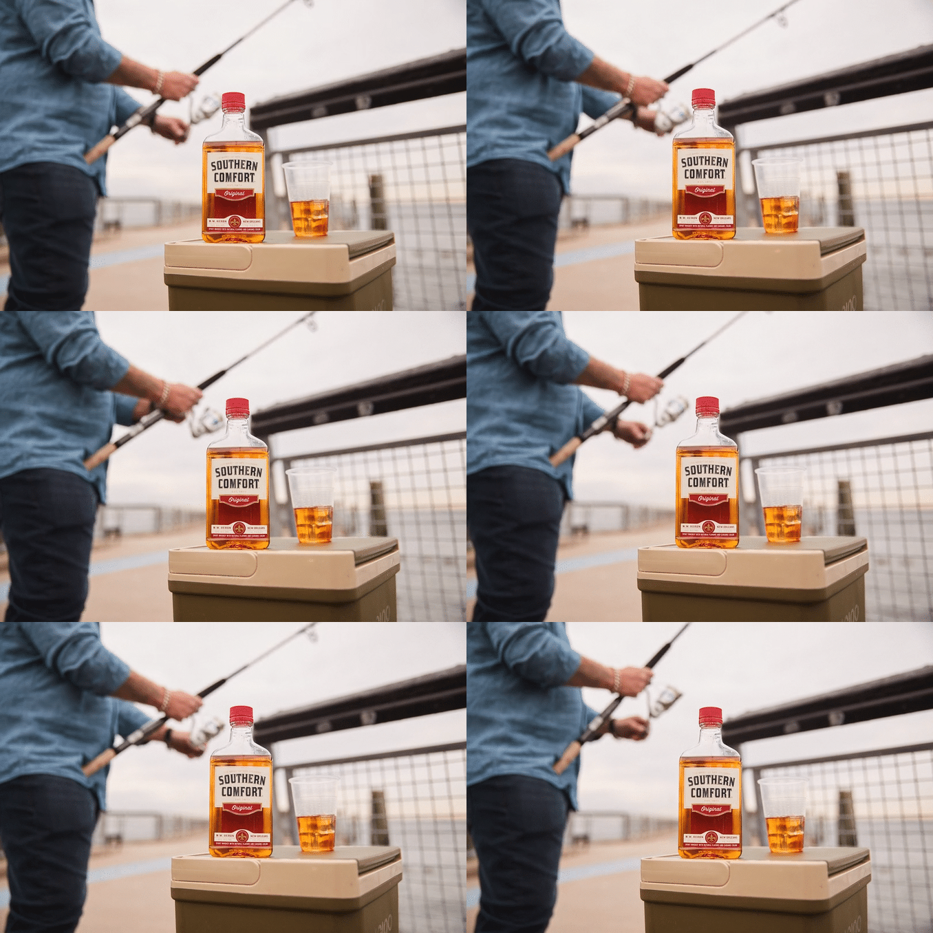
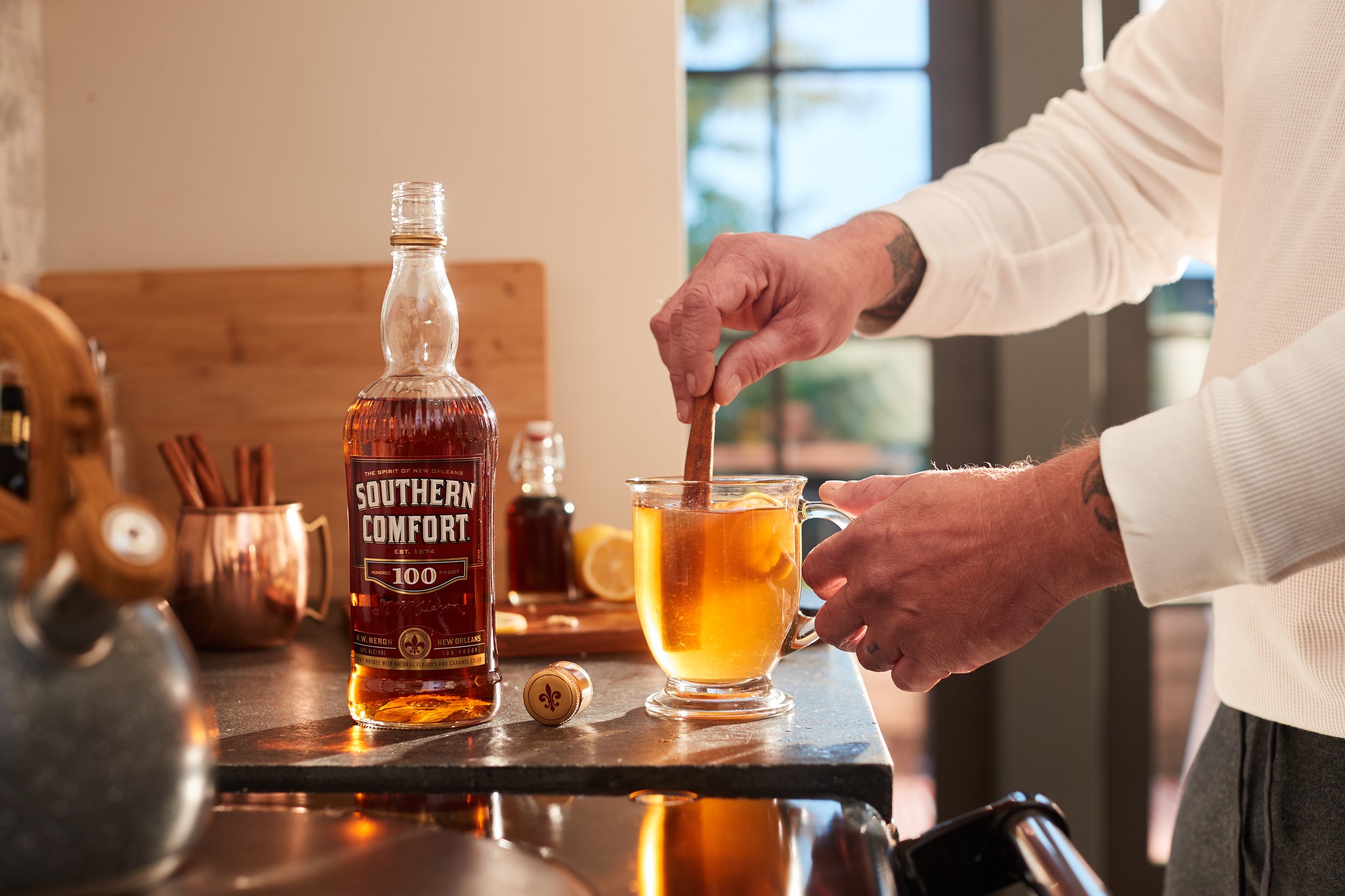
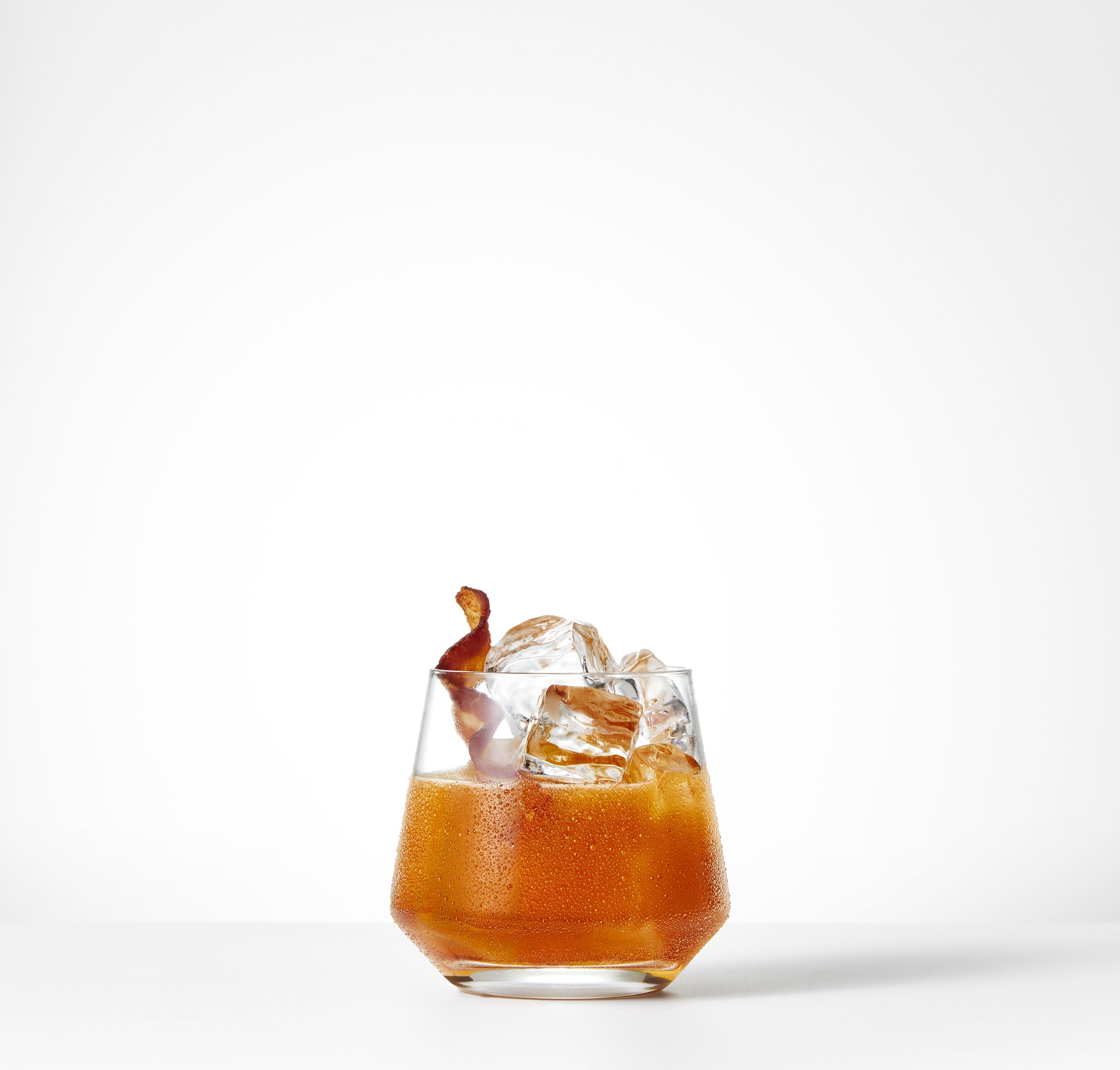
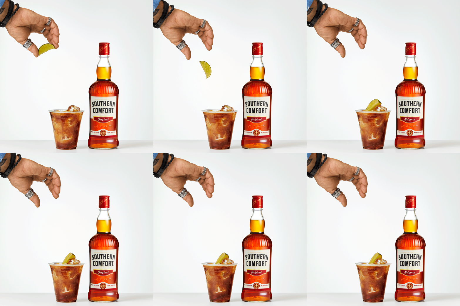
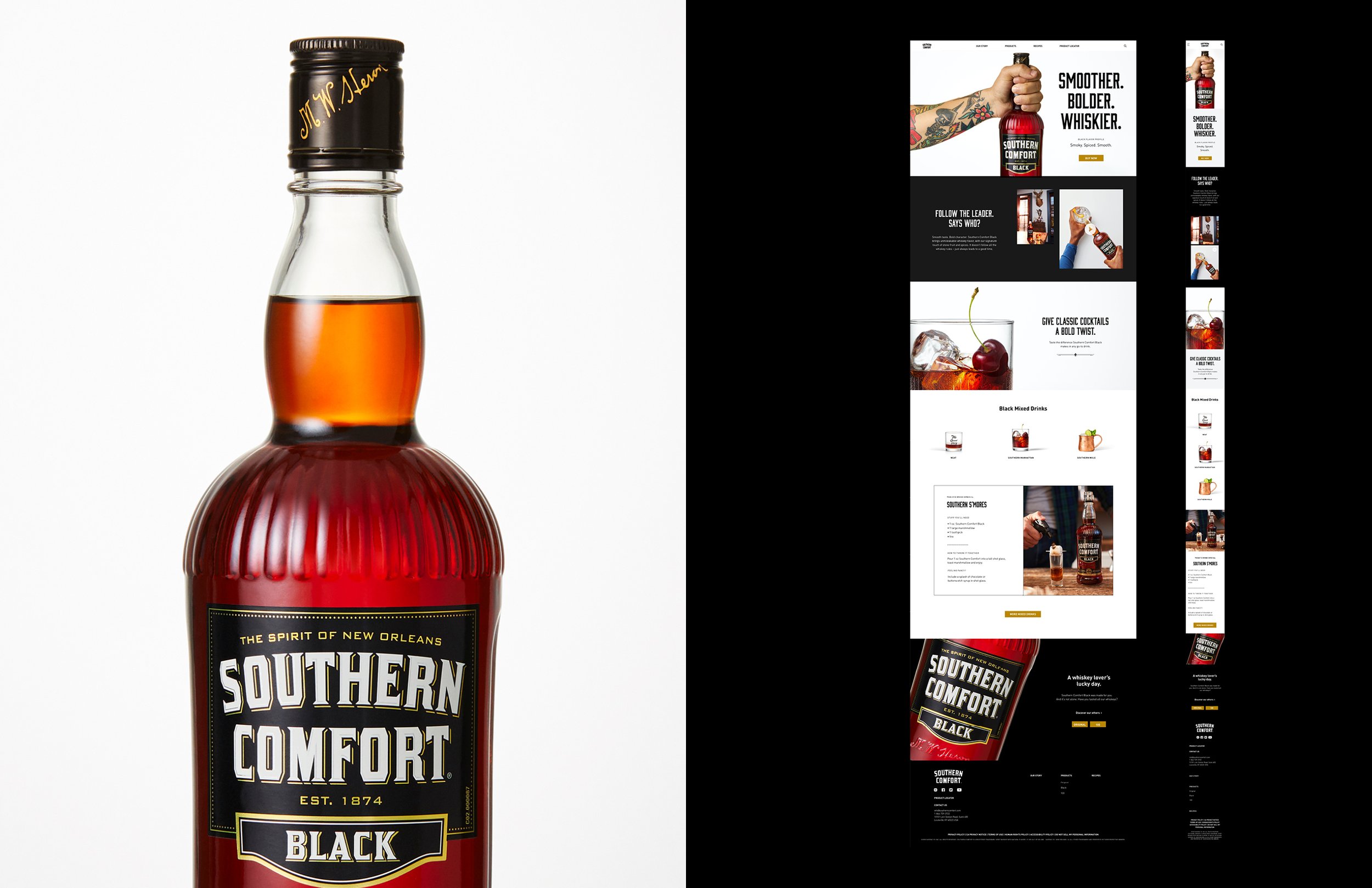
In addition to video, print, out-of-home and social, Southern Comfort needed a brand new website to fit their ‘Comfortably Different’ look. From wireframes to launch the site build took 5 months and officially launched in early 2021.
Front-end design + art direction: Kelsey Reifler
Back-end development: Sagepath
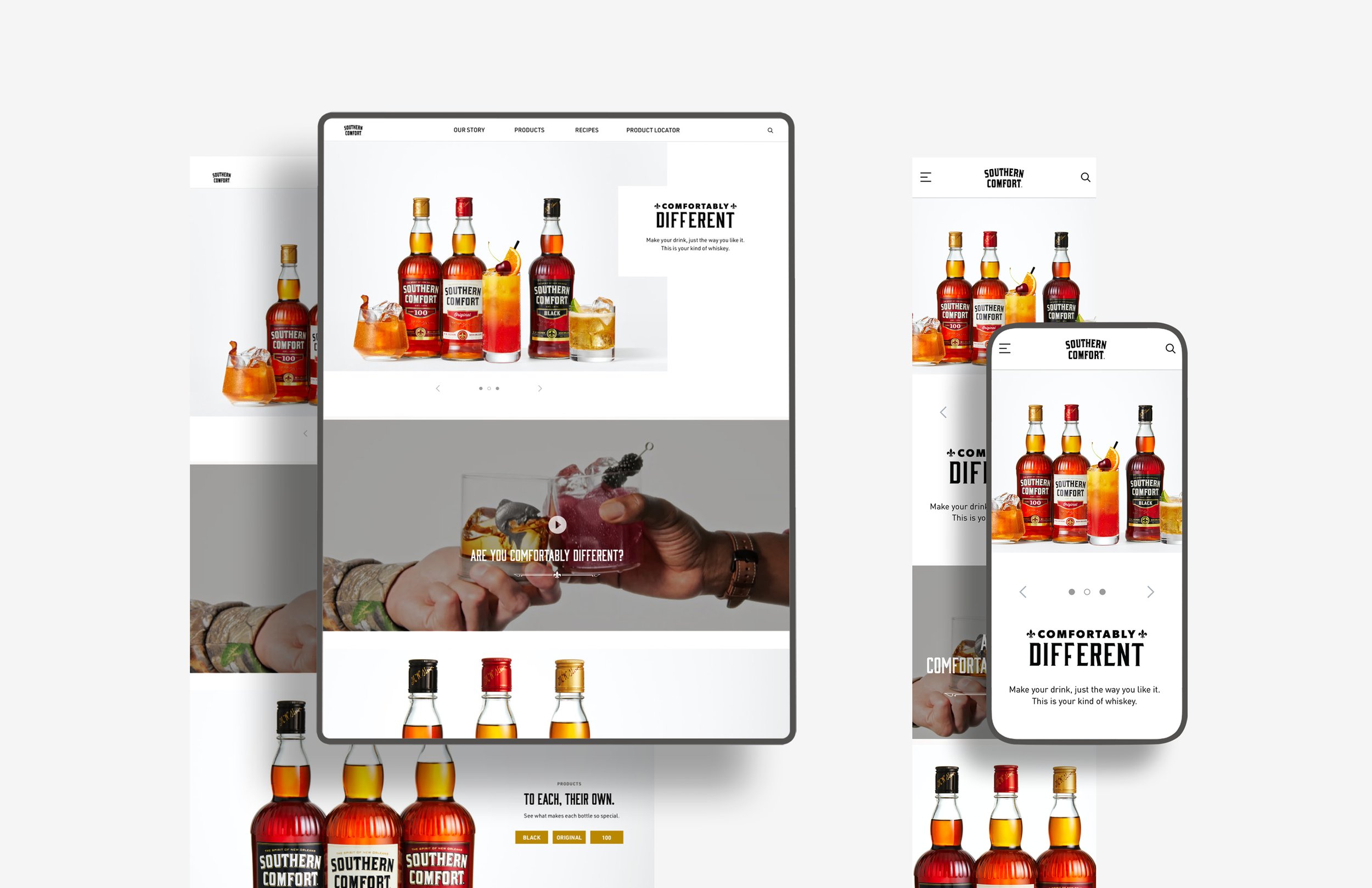



Check out the full website at www.southerncomfort.com


